
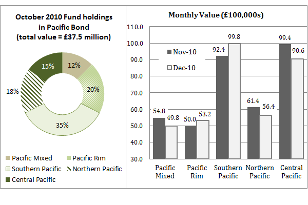
Classic Question 1: What was the difference in value of Central Pacific’s holding between October and November 2010?
This is a classic data interpretation question where you need to look between different sources of information. It also includes some typical unit anomalies to try to catch you out. Let’s work through it.
Step 1: Find the information you need
Whilst the pie chart and histogram titles are different, it should be apparent that they both show monetary values of a fund for different regions within the Pacific. The pie chart shows data for Oct 2010 and the histogram shows data for Oct and Dec 2010. The question asks that we look at the difference between Oct and Nov for the Central Pacific element.
For Oct (the pie chart) we have to work out the number because we are told simply that the Central Pacific element is 15% of £37.5 million. That is 0.15 x 37.5 = 5.625 (£million).
For Nov we can take the figure straight from the histogram as 90.6 (£100,000s)
Step 2: Calcualte the difference
The difficult part is now done but don’t forget we need to pay attention to the units.
90.6 (£100,000s) – 5.625 (£million)
£9,060,000 – £5,625,000 = £3,435,000
Ans = £3.435 million
Essentials Lessons:

Dates Look out for dates, and recognise their different format. Test questions deliberately try to emulate the interpretation required to read numerical data in the real world. So dates are not always straightforward. Sometimes data will be for two seperate periods and it would be a mistake to compare their data like-for-like.

Units It is common for different units to be used within the same question, to test whether you pay attention to detail. Dropping the units during a calculation is a good time-saving technique, but make sure you keep everything in the same units and put them back at the end of the calculation. Some numerical questions include in the multiple choice options answers which look similar to the correct answer but with the wrong units, so be careful.
Axes Some axes do not start at zero, some are truncated, some have no units at all and you have to use the data labels on each data point entry. Again, this is deliberately done to test whether candidates can interpret the data correctly.

Rebased data Some charts are presented as ‘rebased’. This is a useful way of representing comparisons from a reference point and is often used to compare financial performance over time. The important thing with rebased data is that every data point is entirely relative to the rebased point; no not take the values as absolute.
Keys Pay attention to the colour coding or shading of keys and their corresponding data. Different fills and patterns can be used to differentiate between data groups and if you’re not concentrating you could mix them up. It is important to note that colours will be used which avoid disadvantaging colour blind candidates; patterns or single colour palates will be used.